Modernizing Honda's customer payment experience
In today's landscape, we recognized that outdated '90s designs constrained established corporations like Honda. Our team reimagined their experience, focusing on customer retention, engaging interactions, and a platform aligned with modern consumers' expectations, while preserving the needs of Honda's loyal customers.
This is an industry project with a team of 4 designers specialising in UX and visual design.
CLIENT
Honda and Acura
TEAM
3 UX Designers and 3 Visual Designers
DURATION
6 Months
PLATFORM
Mobile and Desktop
Project Description
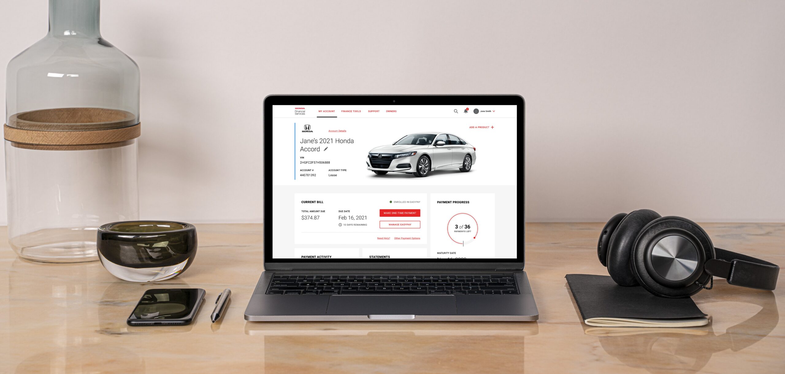
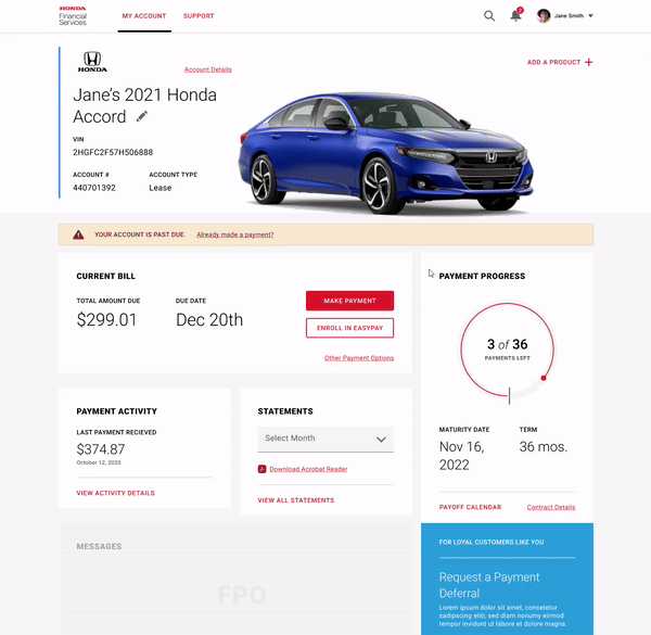
This is an online portal designed to manage vehicle lease or loan payments. It is available for Honda and Acura customers. Our goal was to modernize the user experience and visual language by rethinking the payment and account management customer experience.
The service provides customers with multiple payment options, the ability to track expenditures, set payment schedules, communicate with customer support, and manage payments for multiple vehicles, all in one seamless platform.
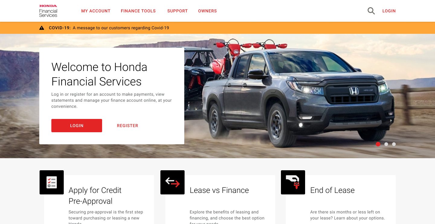
From tedious paper-work to seamless digital transactions
Project Concept
Who enjoys going to the bank to handle paperwork anymore? That's a thing of the past.
Our goal was to transform these tedious tasks into seamless experiences. As more services move online, Honda embraces this shift by offering a convenient way for customers to manage their vehicle payments, reflecting the future of digital convenience.
Objectives
- Study the current website
- Gather insights and pain points from users
- Creating a new information architecture
- Designing new tasks & user flows
- Outlining features from user stories
- Designing wireframes and visual designs
Restructuring the information from old to new

Our Impact
Solved end experiences and drop-off points from 60% to 40%
Shifting to an entirely online model, boosting conversion rate by 20%
Boosted NPS score by 70 through intuitive user experiences with clear documentation for faster, better-informed decisions.
Increased capture rate by 80% by reducing steps to pay and tailoring payment options to user needs and goals.
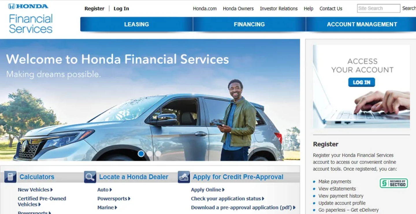
Let's study the old website, Loading...
Heuristic Evaluation
We analyzed the website through heuristic evaluation and flow mapping, revealing its outdated user experience.
- Confusing Layouts
- Complex journeys
- Lack of Documentation
- Dead pages
- No payment feedback
Opportunities
As we created a flow based on the current website, we discovered opportunities and flows that can be improved.
Various elements and page structures that can be changed to get the most of what the site has to offer.
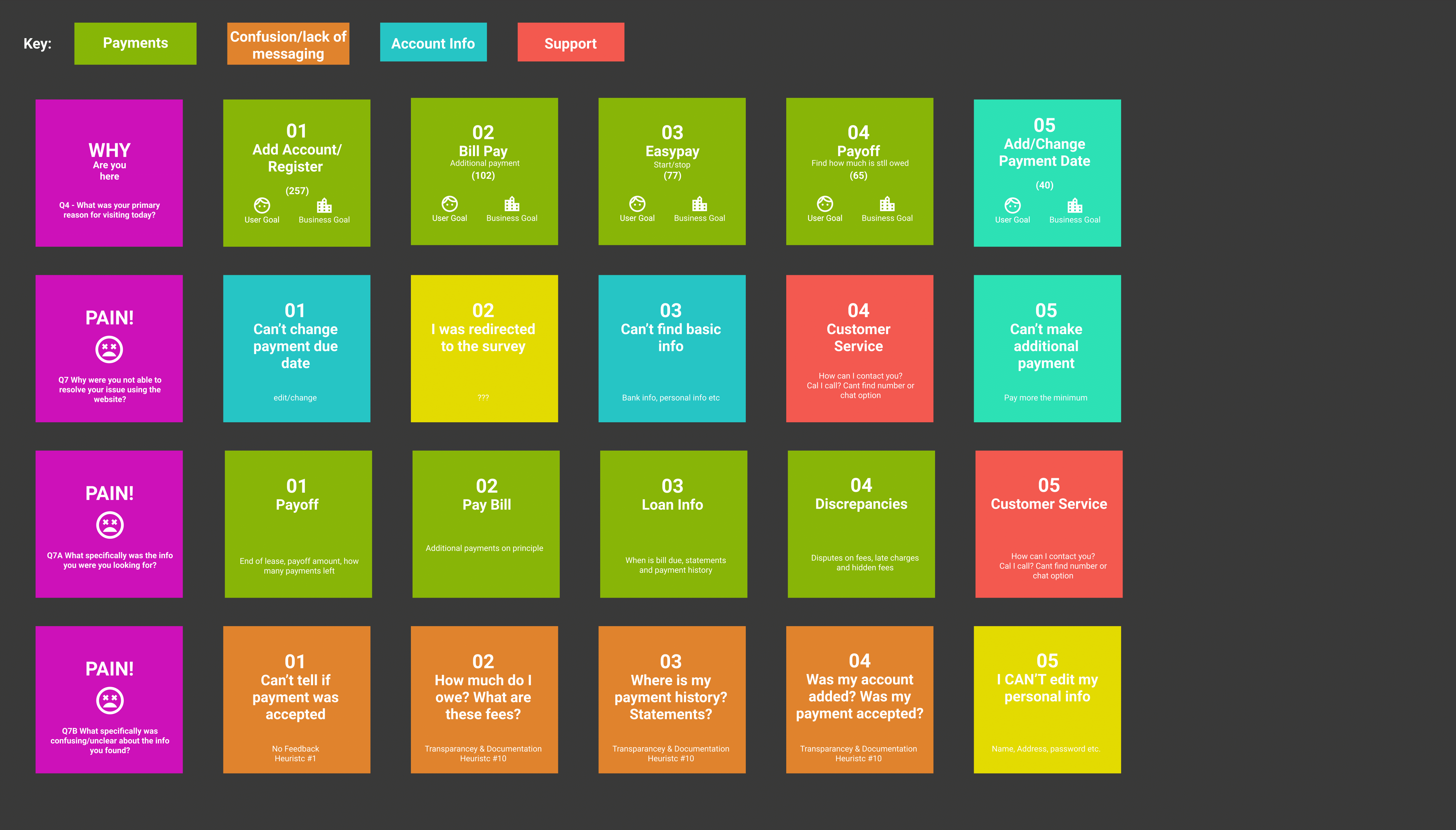
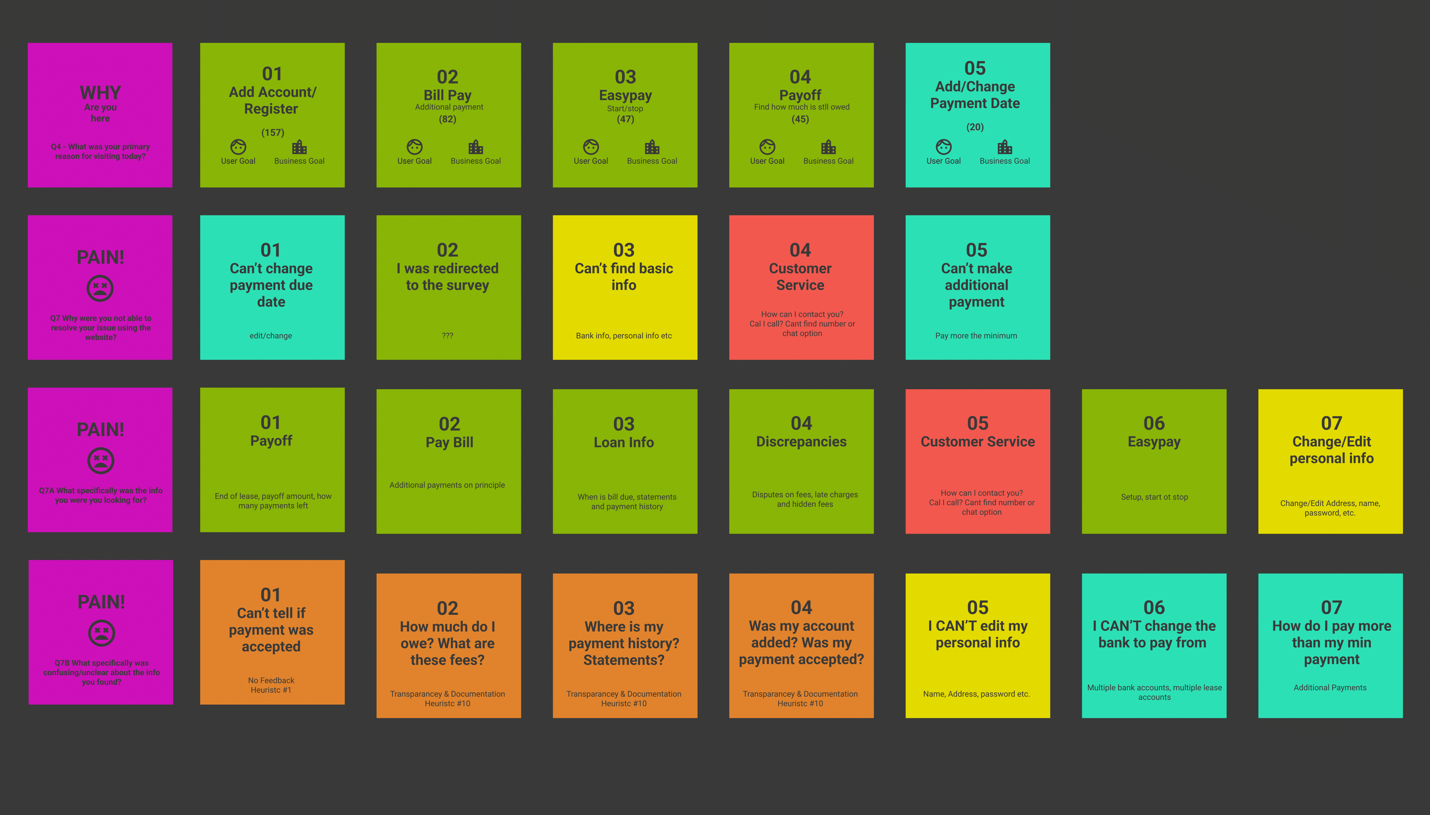
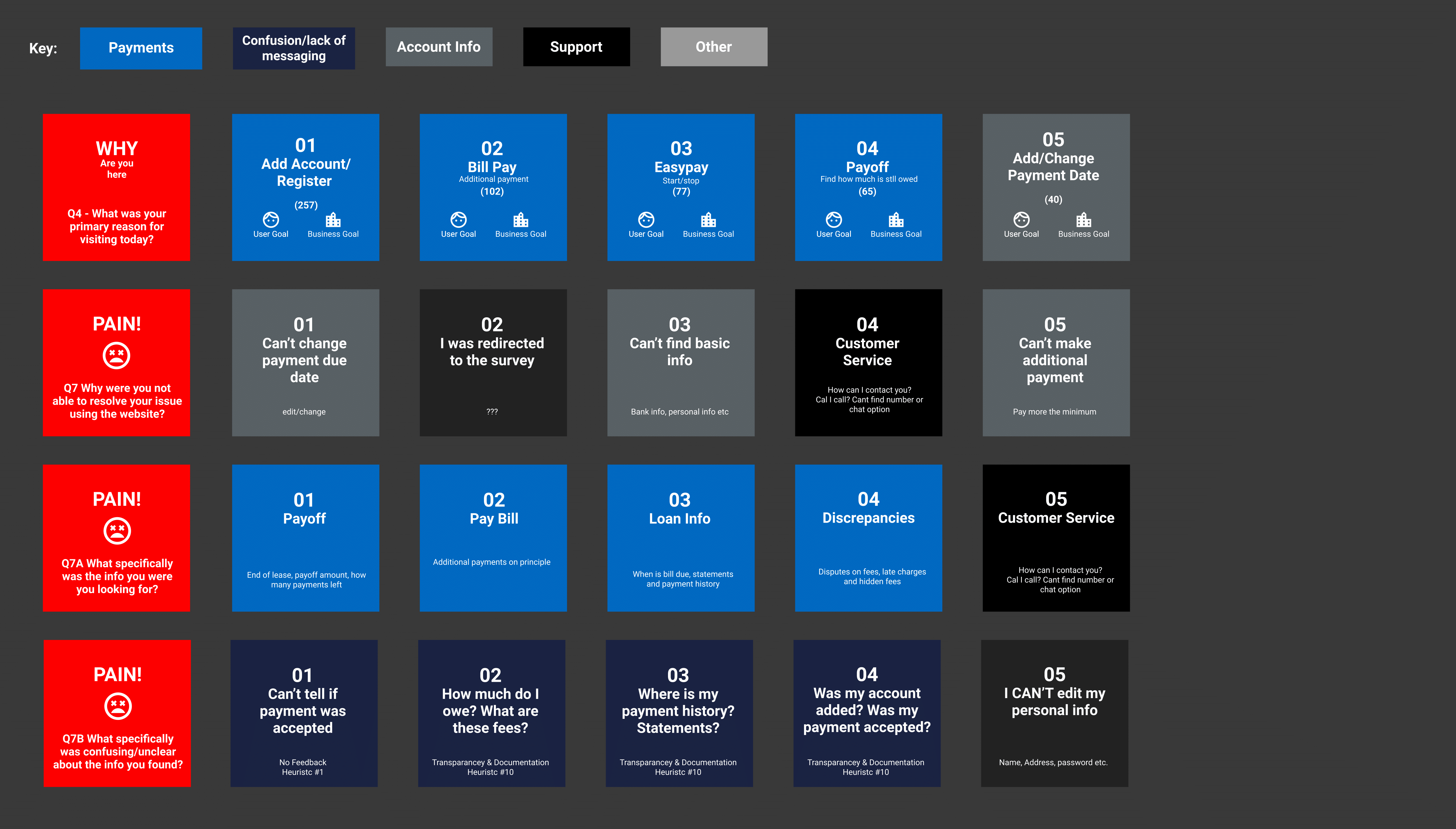
What are the users going through?
Goal of the Study
We wanted to learn the pain points, why they use the website, and what is difficult for them. Through surveys, we got the pain points and valuable information about the users. The major questions are mentioned below, from which we based our survey.
Information Architecture
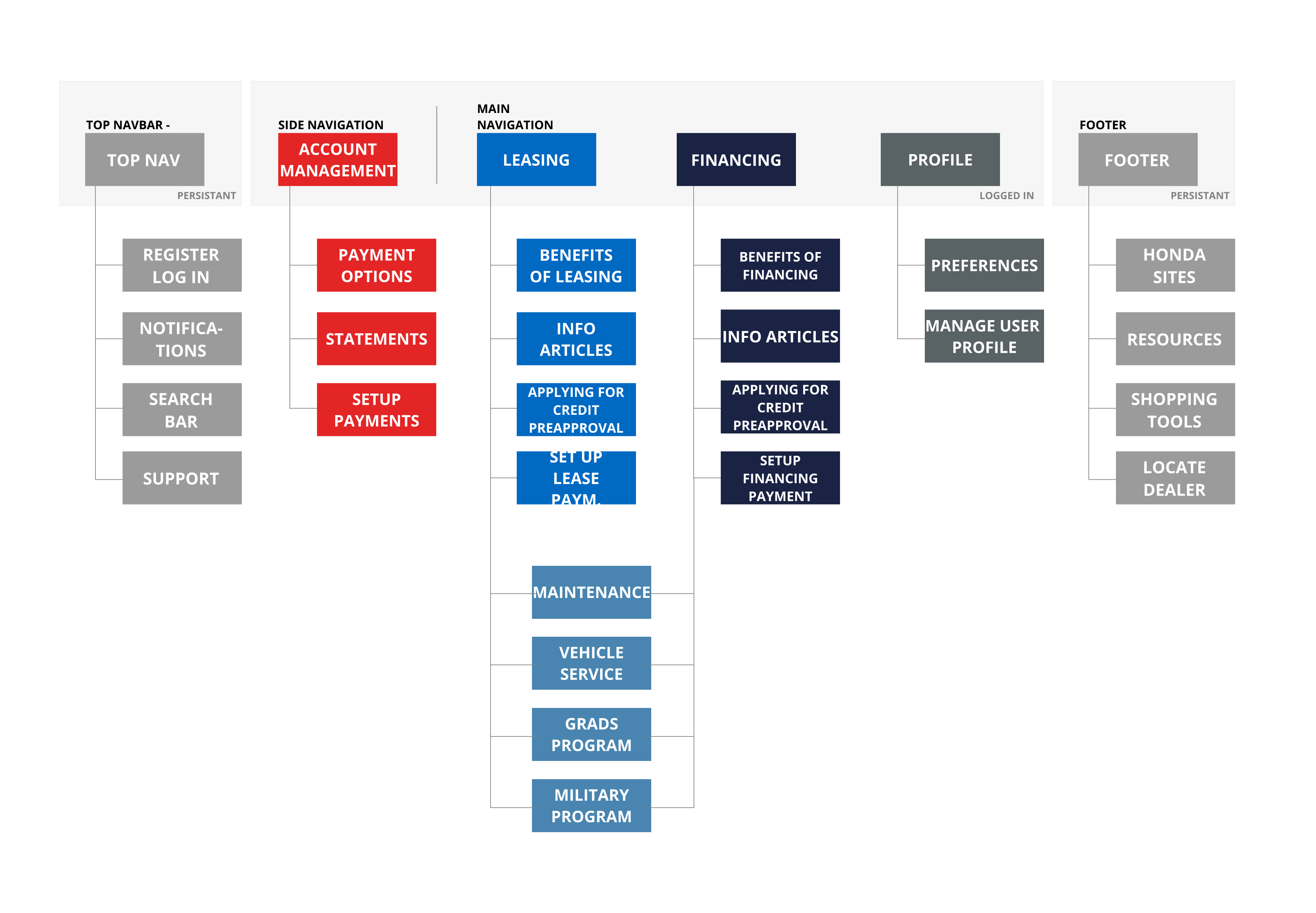
The 3 core principles driving our design approach
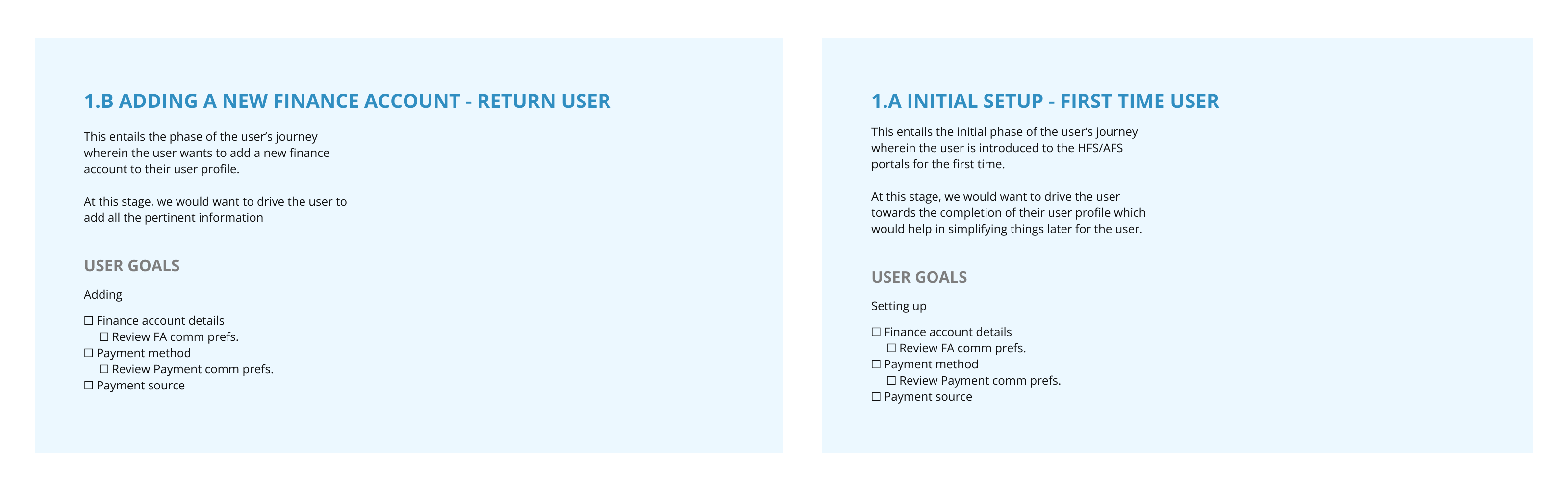
Users
We began by defining clear goals and user flows for both first-time and returning users, recognizing their distinct needs. Our approach focused on designing tailored experiences that address their specific requirements.
Payment Methods
Next, we identified two distinct payment methods for each user type, leading to a seamless and personalized payment experience.
End Experience
By defining clear goals, segmenting users, and streamlining tasks, we created intuitive journeys that addressed the challenges of the previous website.
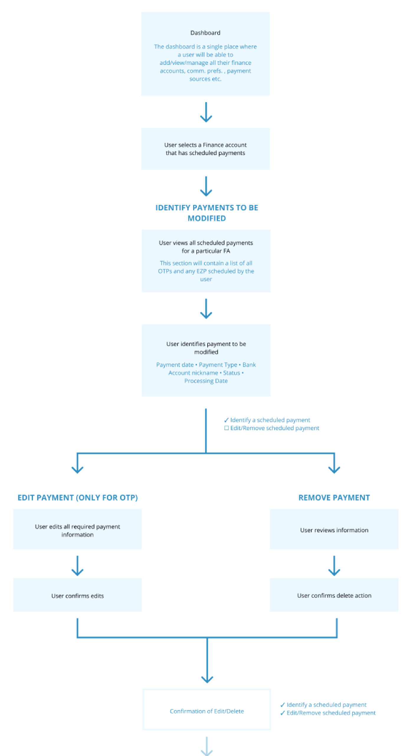
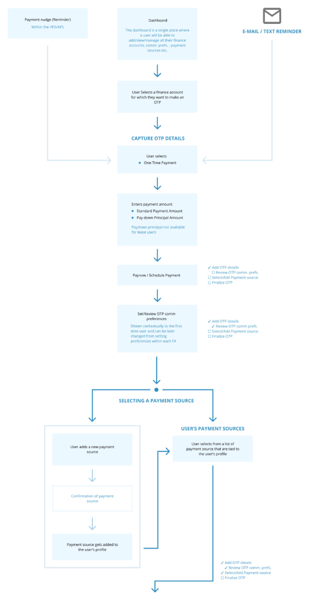
User Goals and Flows
With the previously made requirements and goals, we created flows for each scenario.
Transforming concepts into reality
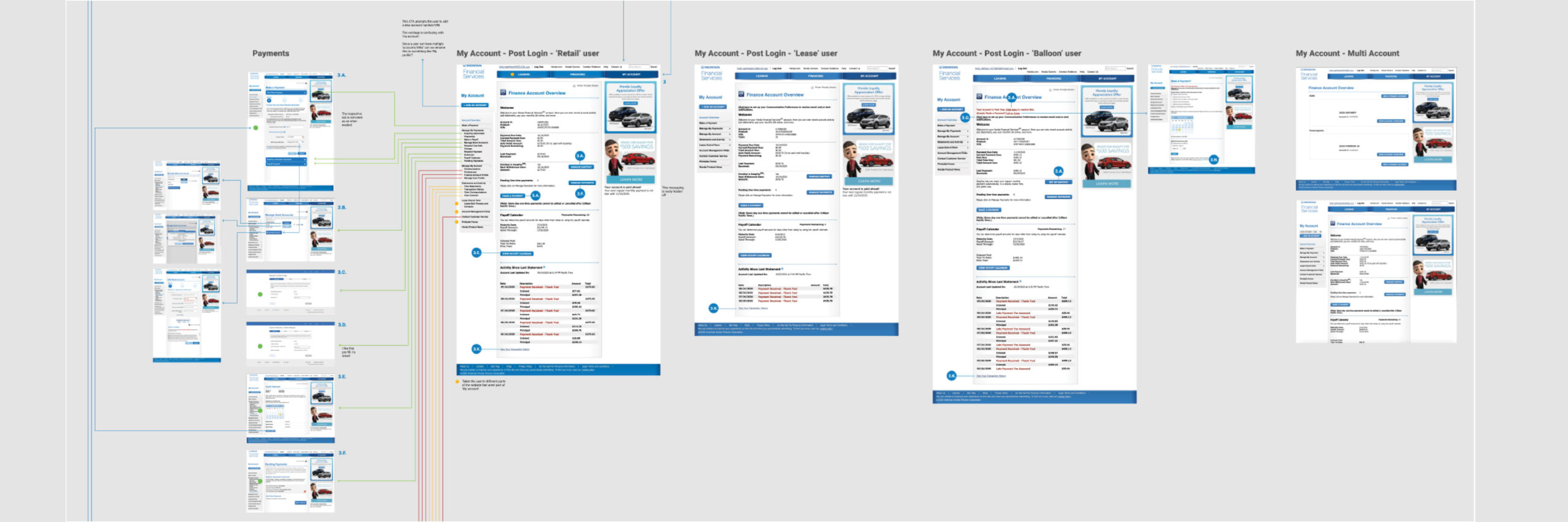
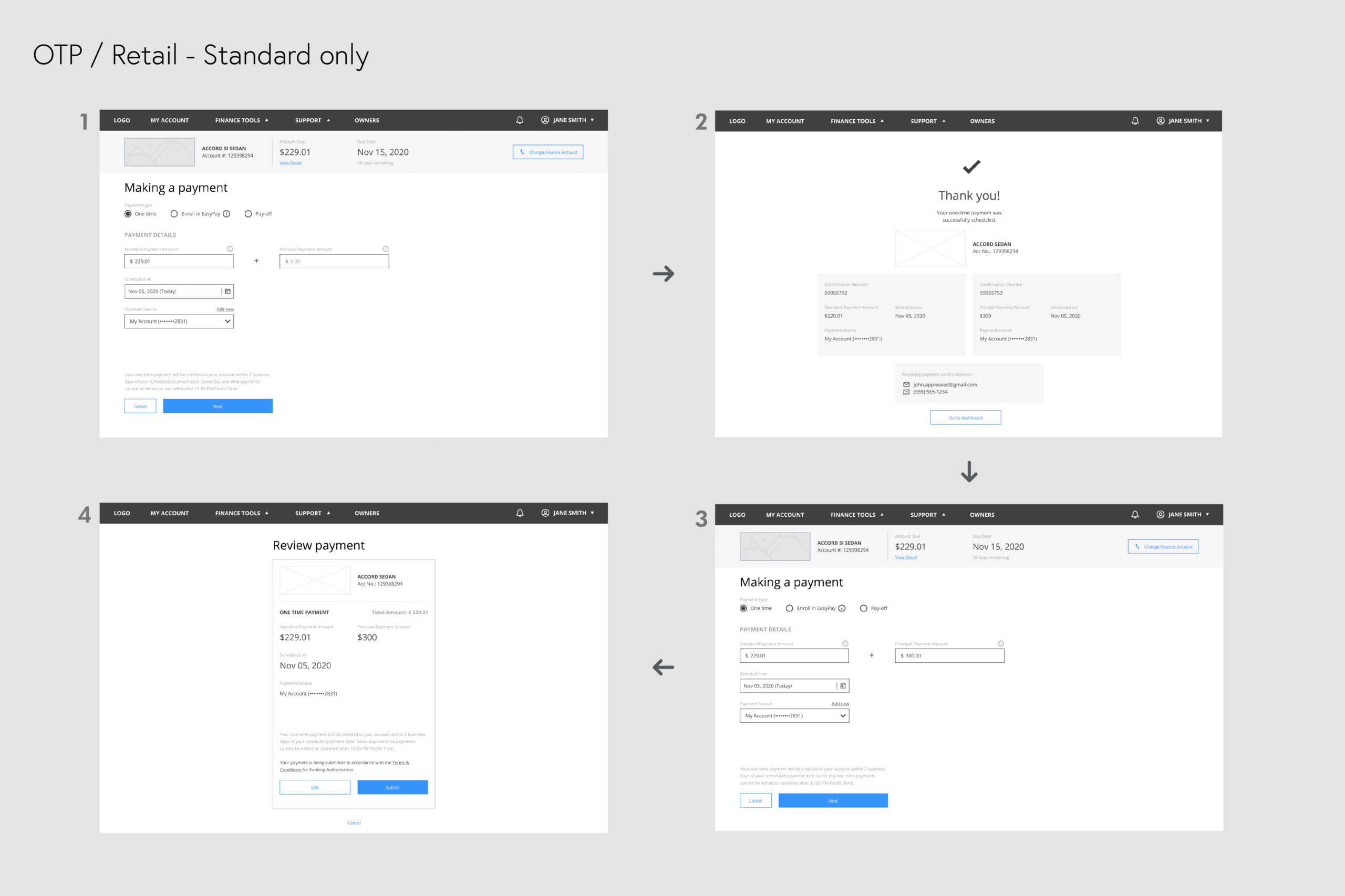
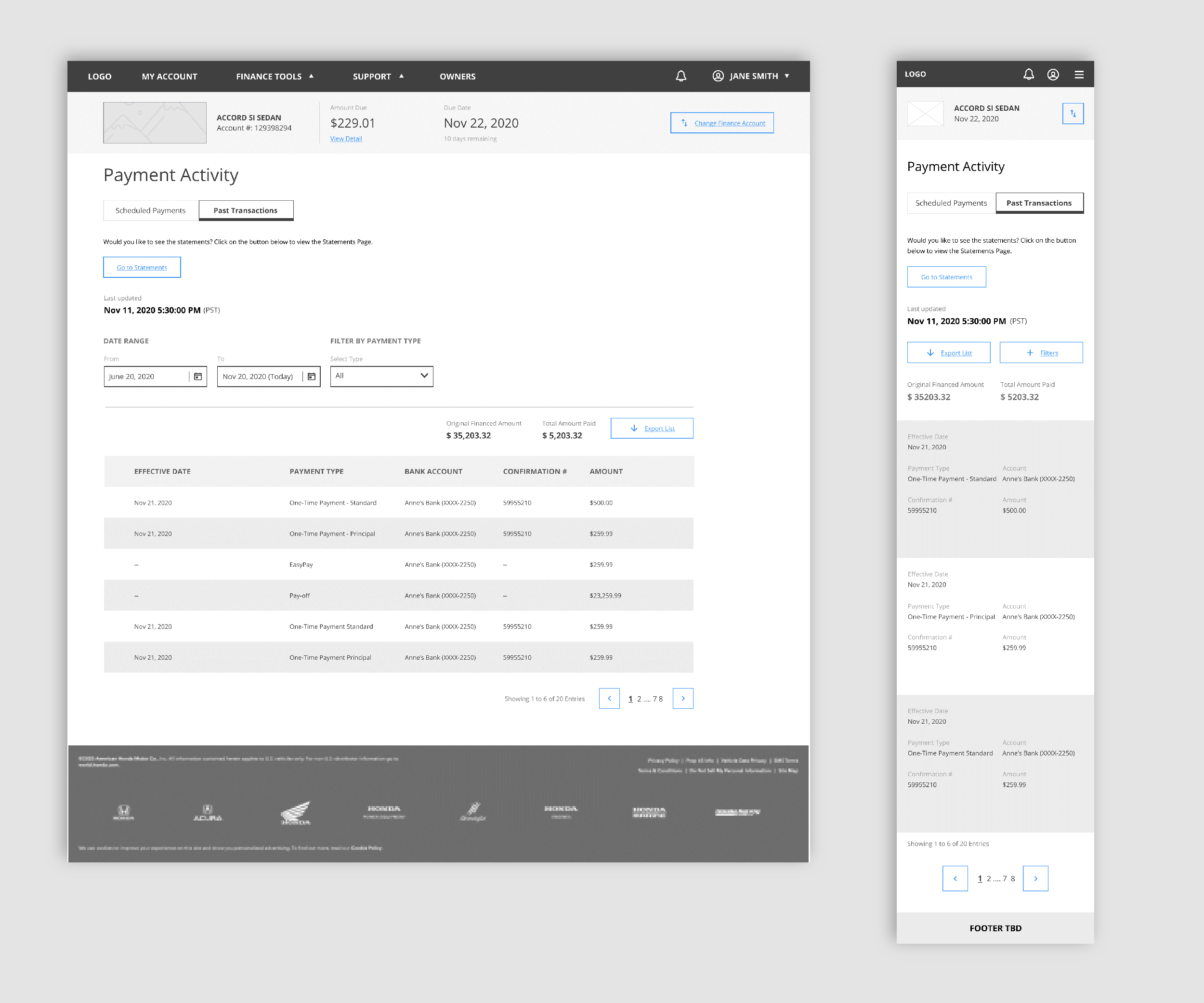
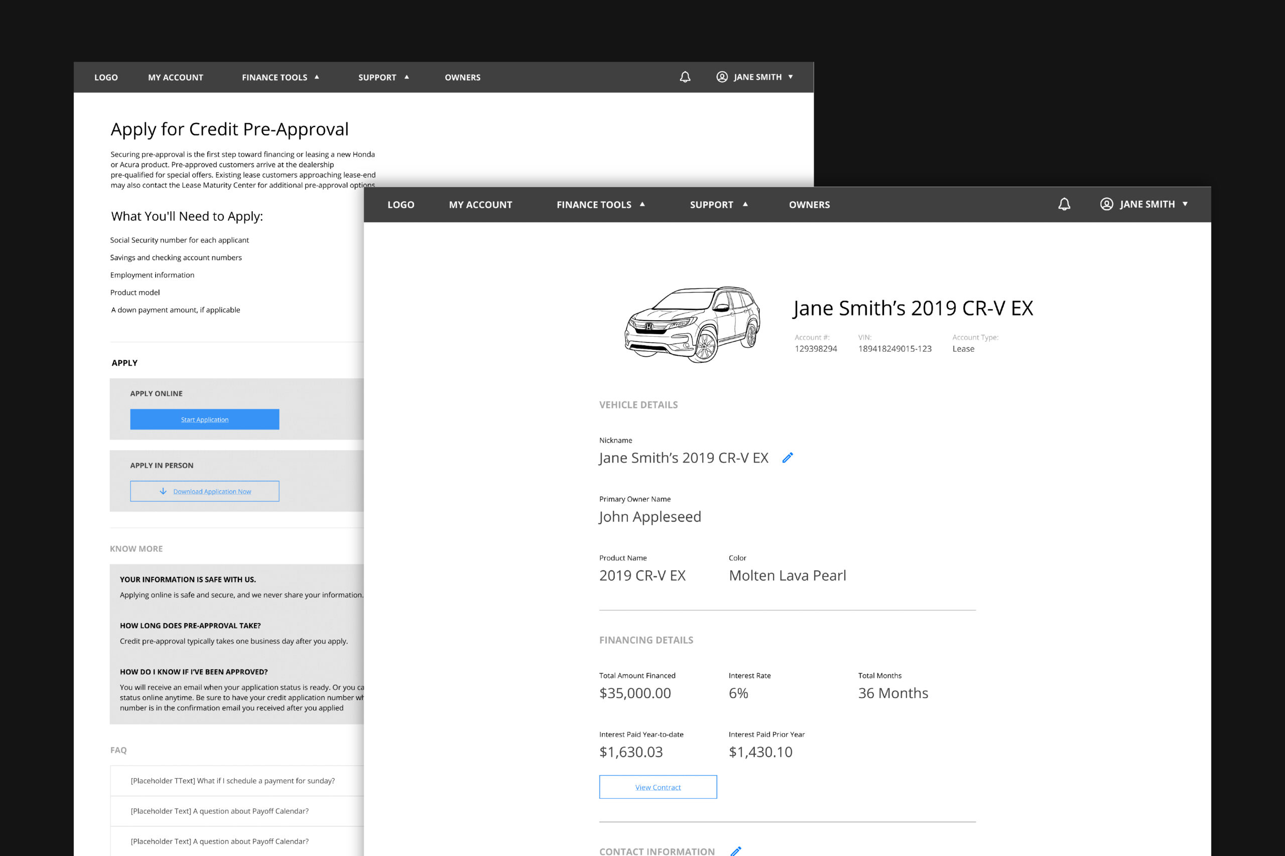
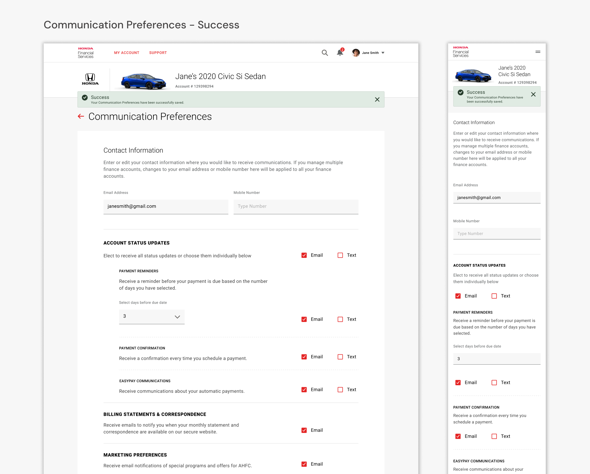
The final stage of the redesign involved creating wireframes, but first, we gathered client feedback on the new user flows and site architecture to ensure alignment with their expectations.
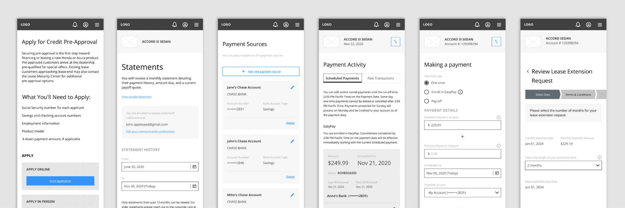
As part of the UX team, our responsibility was to develop high-fidelity wireframes for the visual design team. These wireframes underwent multiple iterations based on client feedback before being handed off to the UI team for final design implementation

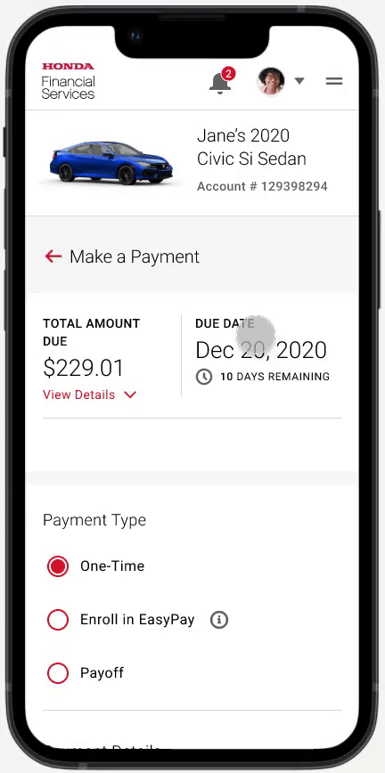
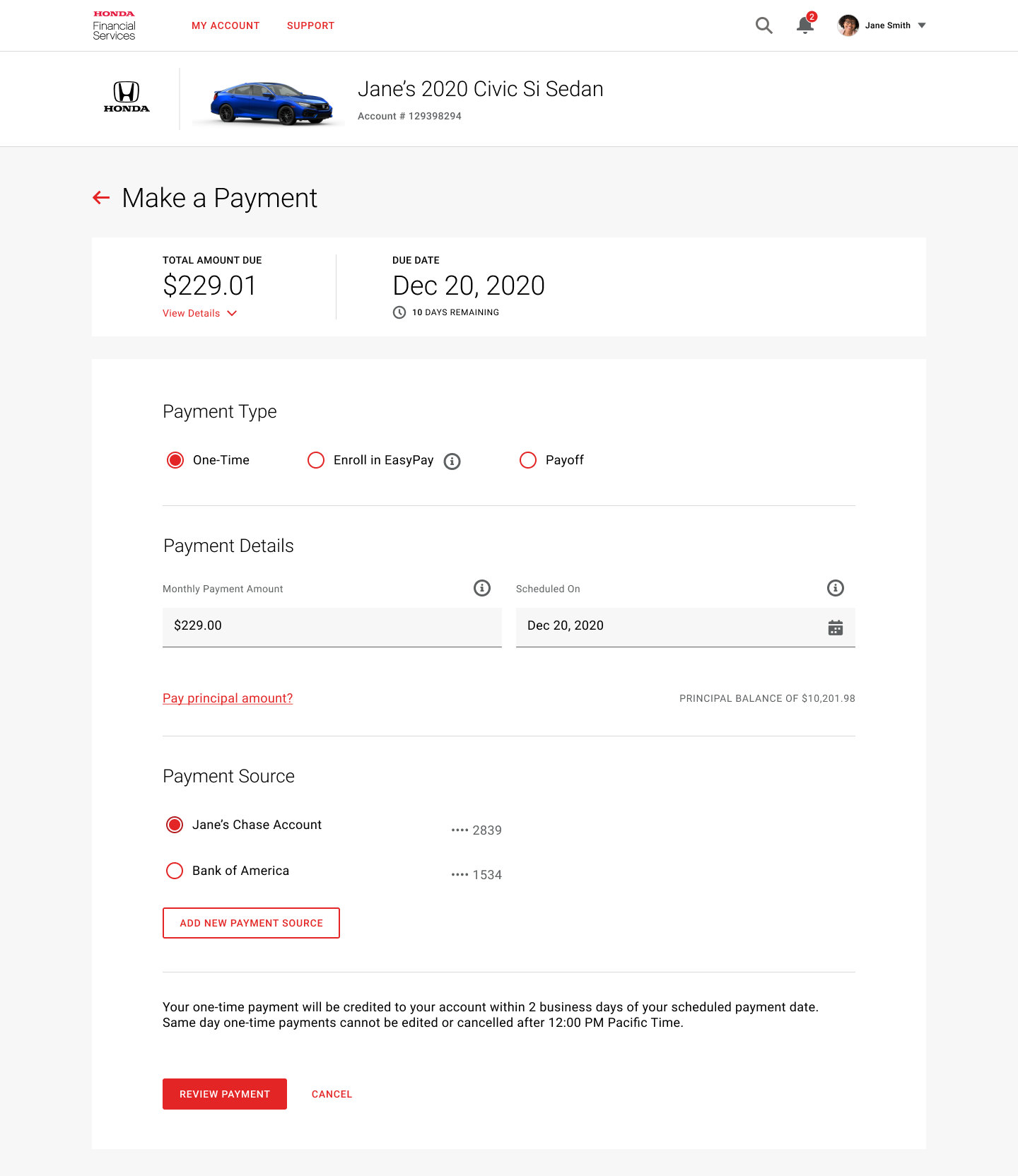
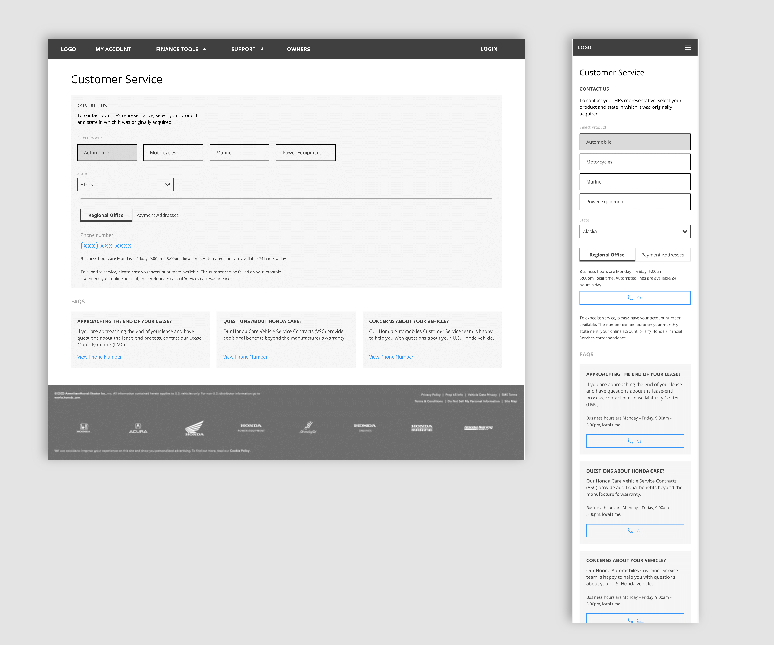
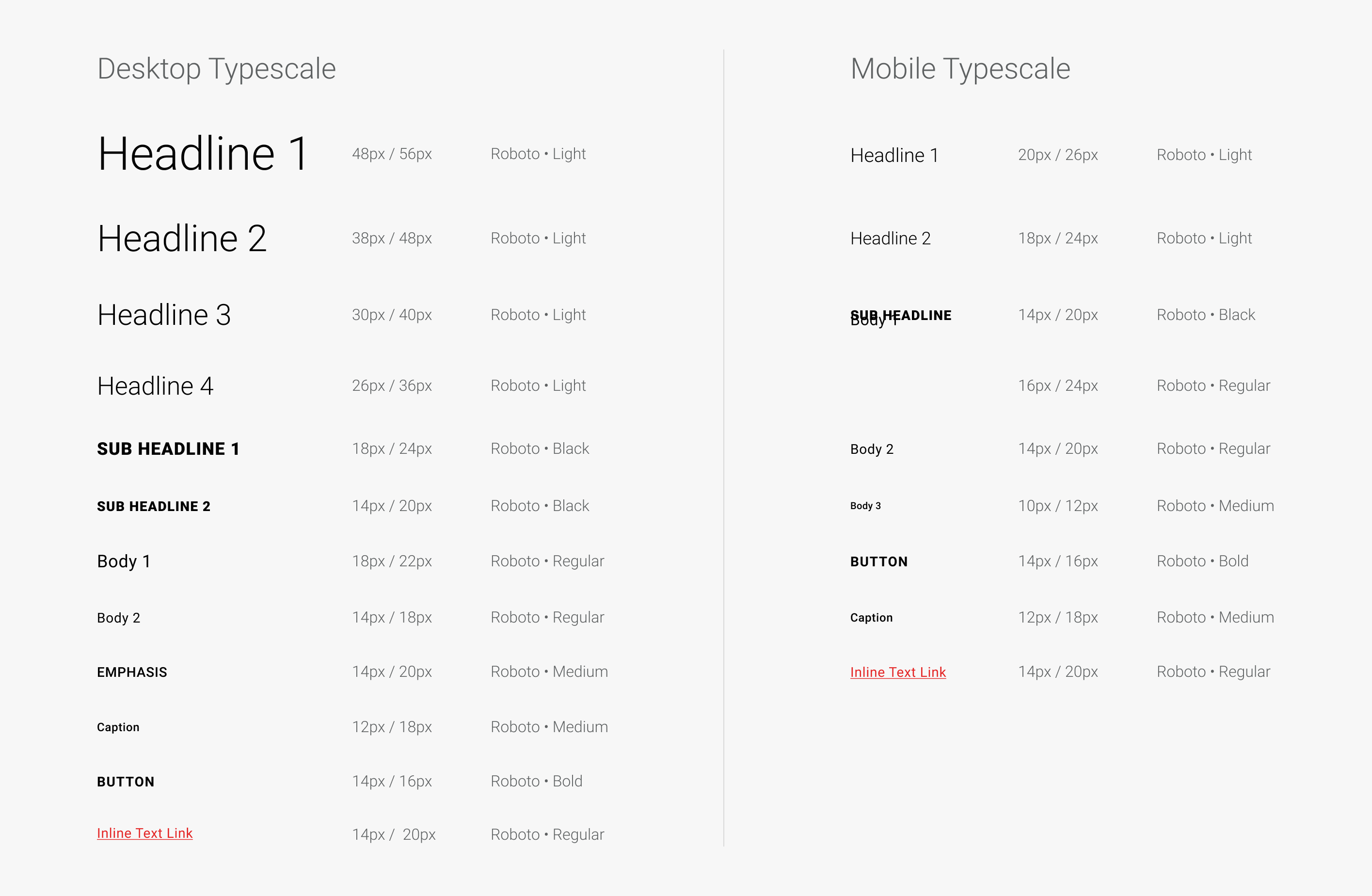
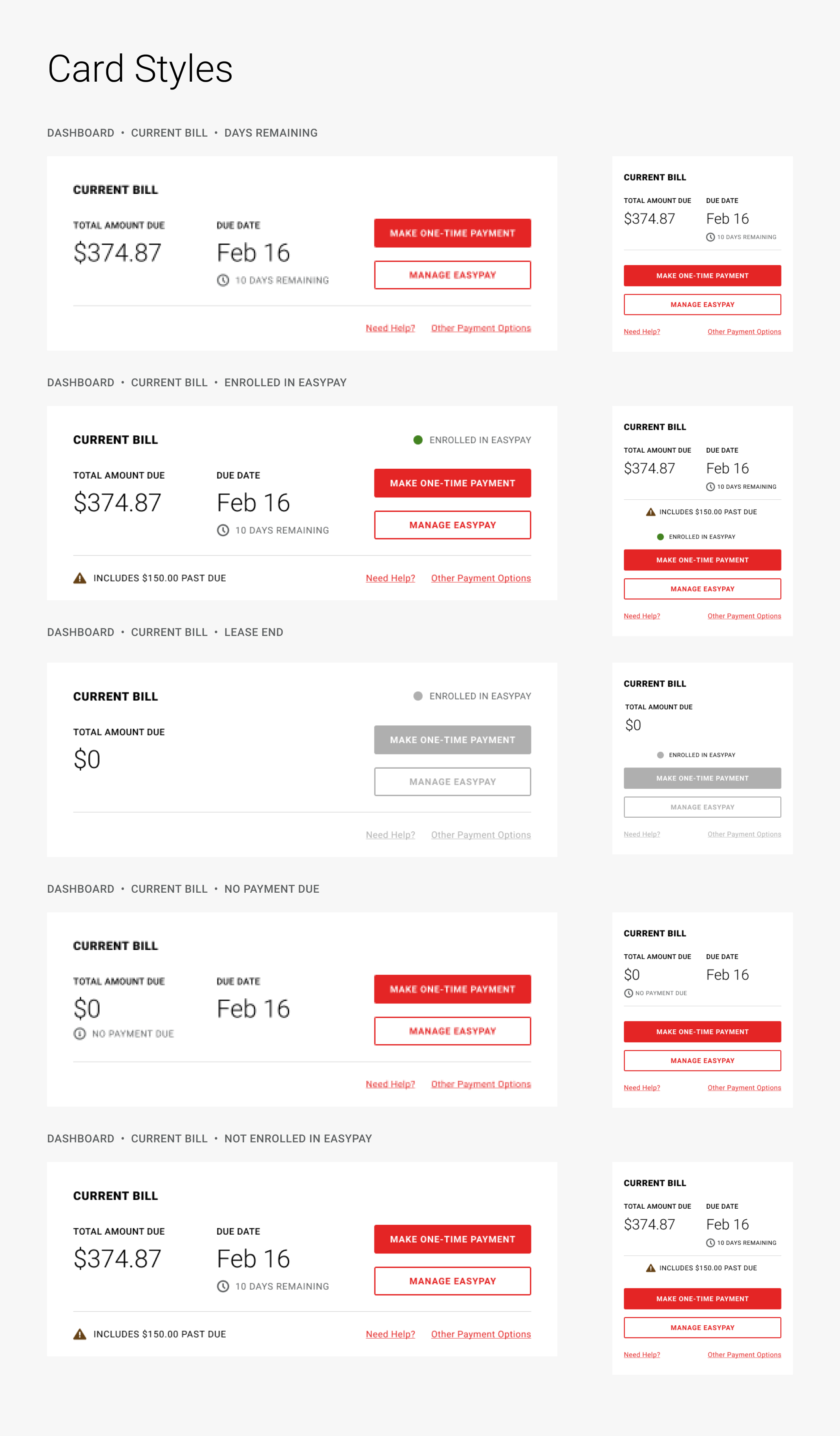
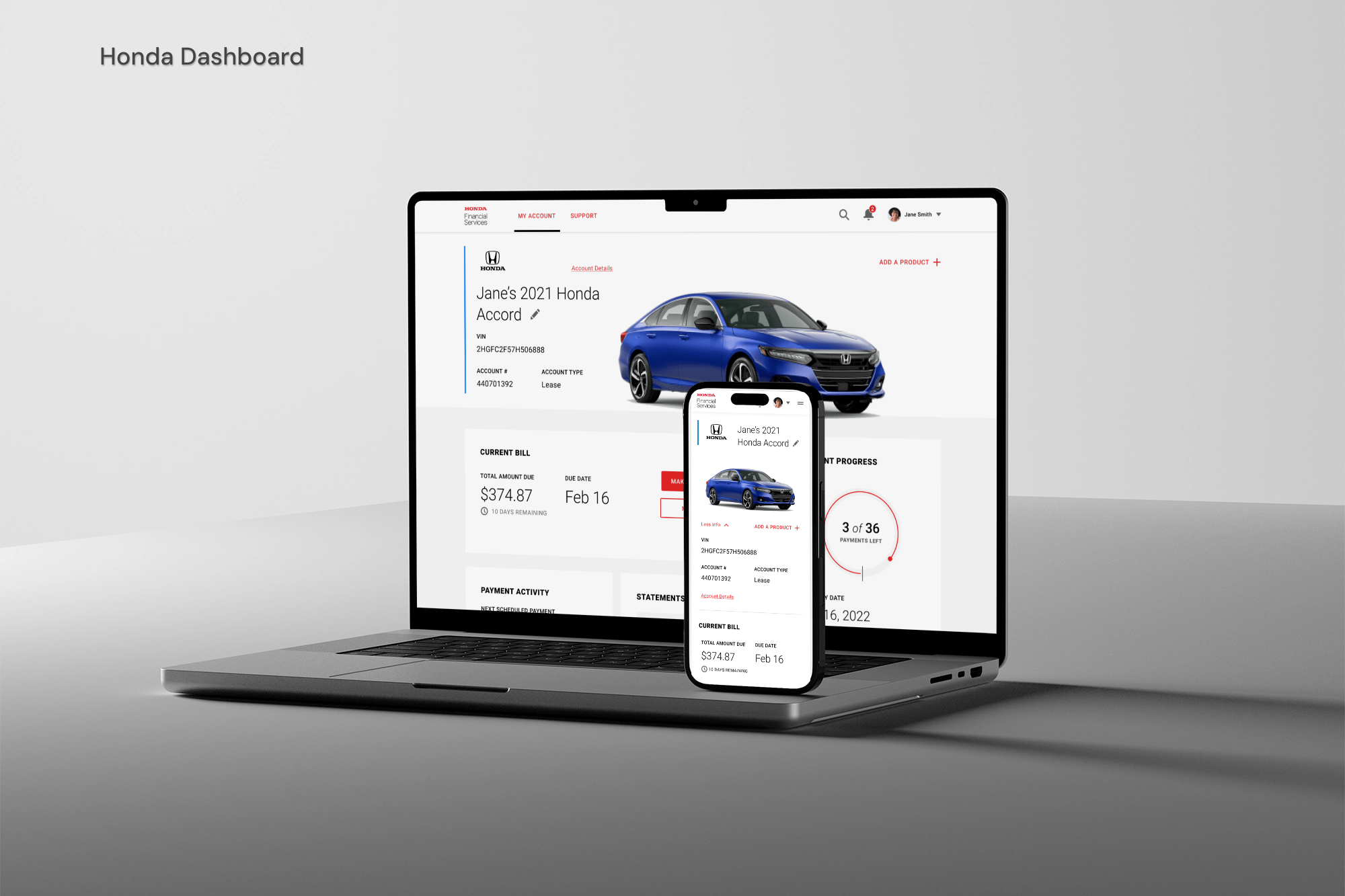
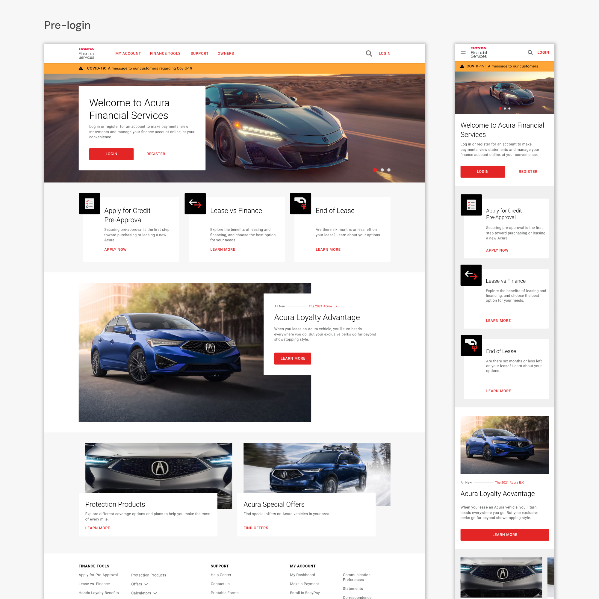
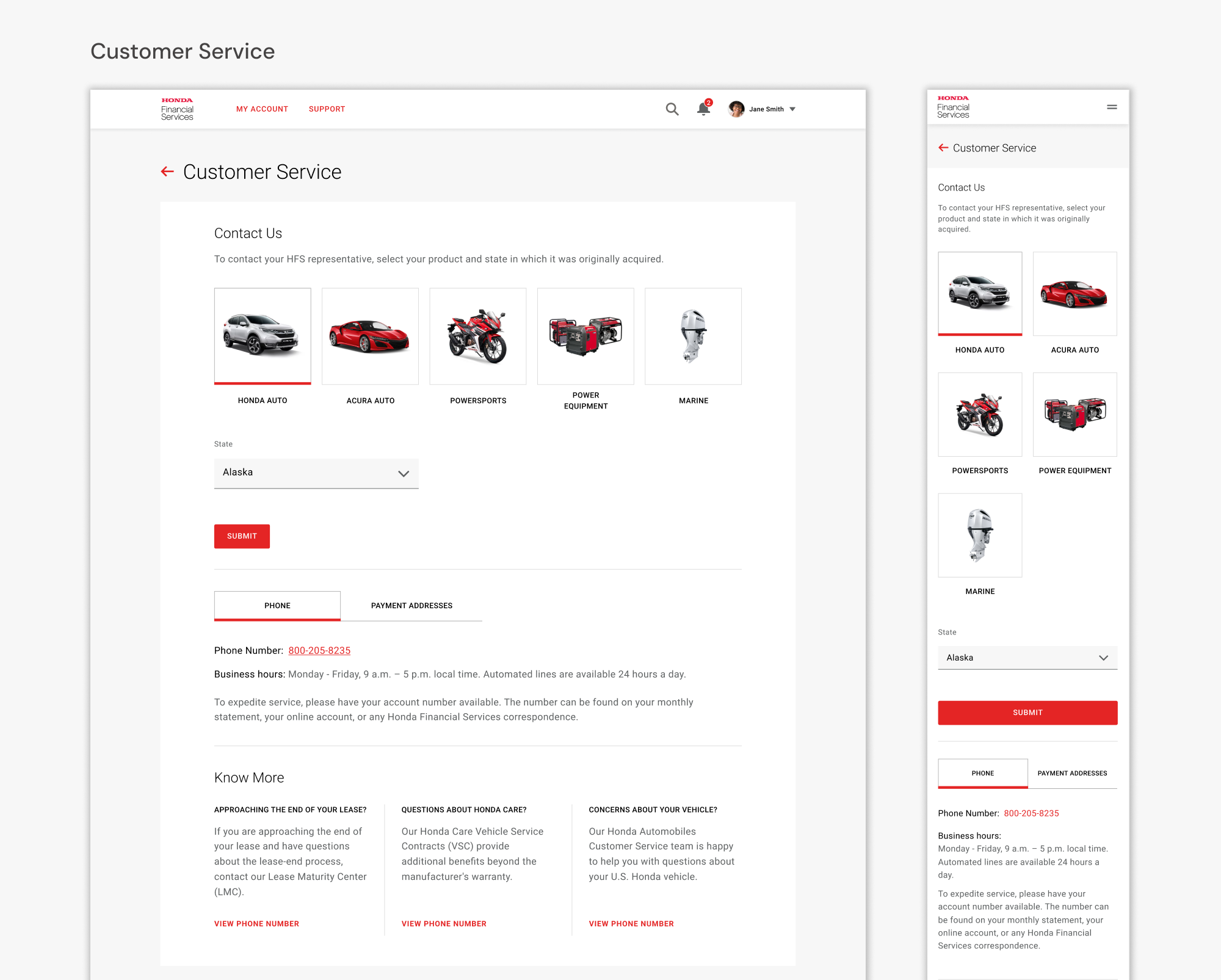
Responsive Design
We prioritized a mobile-first approach, ensuring all components and features were optimized for functionality across devices. While designing for desktops, we simultaneously developed mobile adaptations, maintaining consistency.
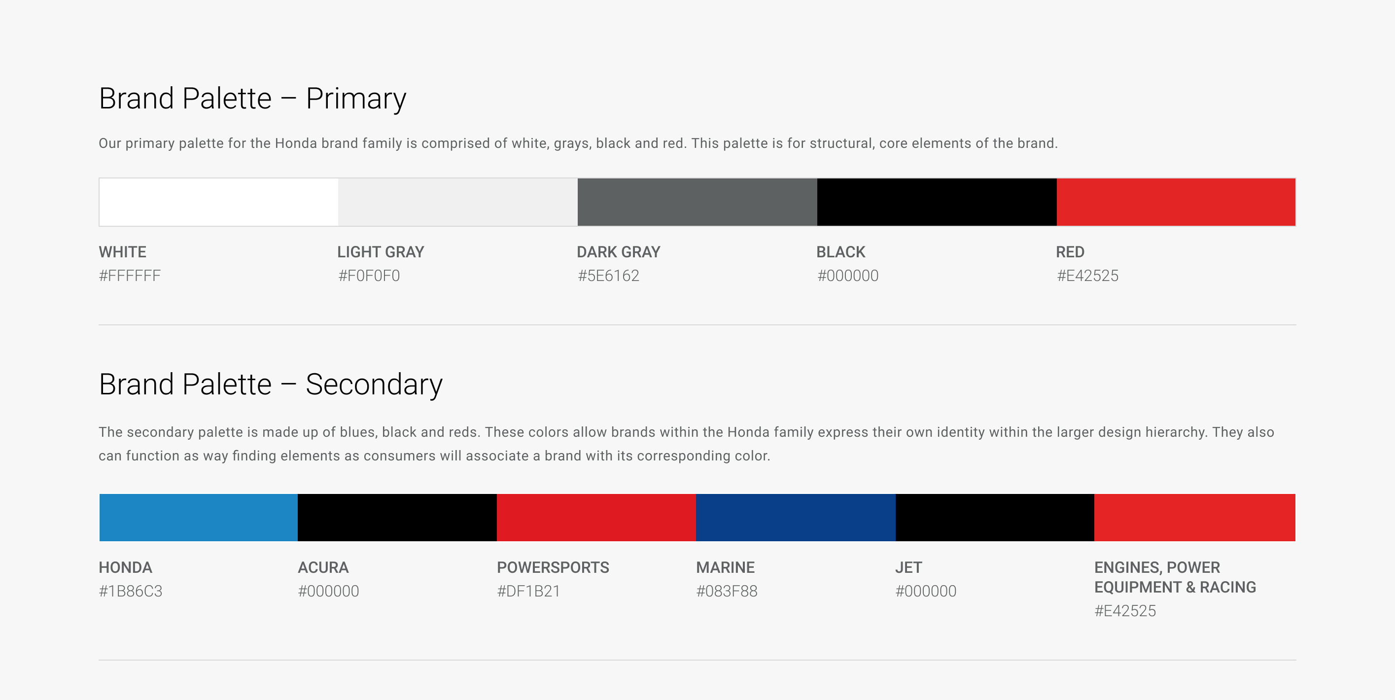
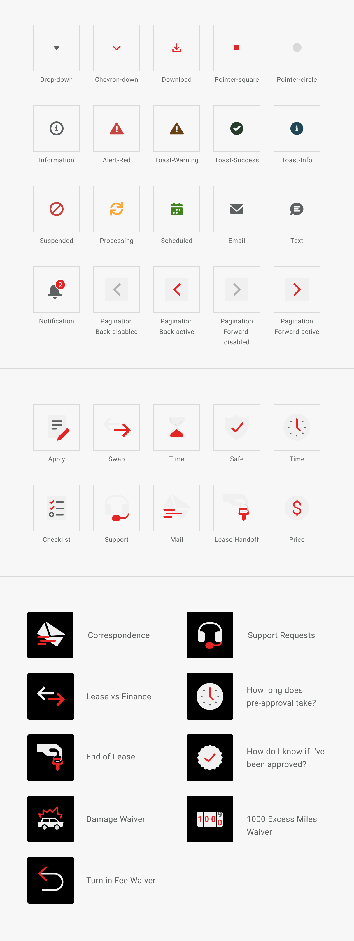
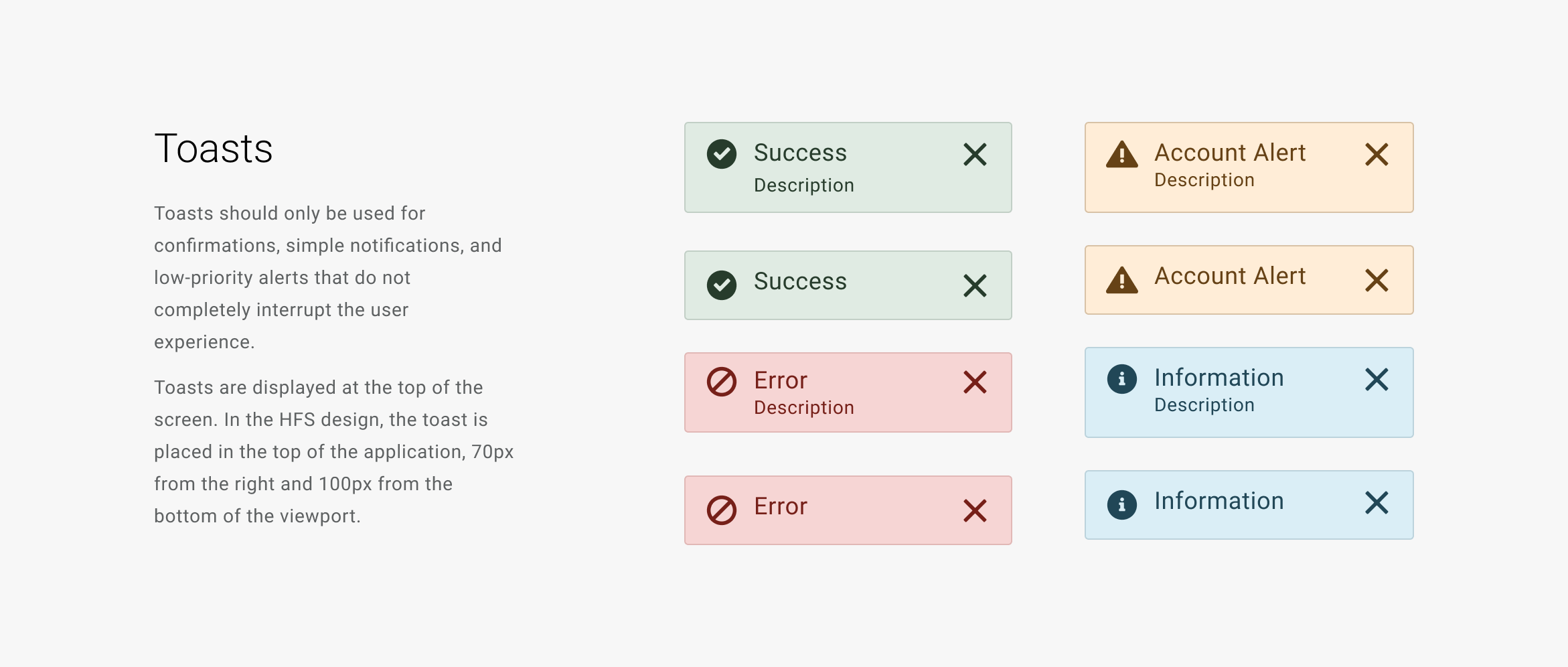
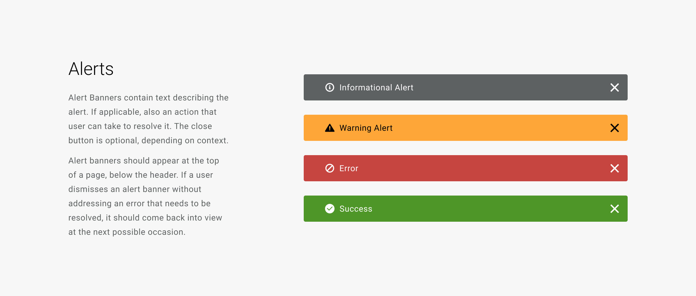
Design Systems & Direction
The UX and visual design teams jointly created a pattern library of reusable components that ensures consistency, accessibility, and best practices while solving common design challenges and meeting user needs.
Visual design
Selected Works

Agile HCTProject type
Research PhotographyProject type
Honda RedesignUser experience
Behavioral DesignBehavior Design
WikisickUX design

Climate WorkshopProject type